ACT brings together a focused set of tools for analysing, selecting and converting colours, with accessibility checks built directly into the workflow.
Main colour controls and previews
The main controls let you enter foreground and background colours directly, then lighten or darken each one in 5% steps. Two live preview panels show the current foreground and background selections, including transparency, and a switch control swaps the colours instantly.
- Direct input for foreground and background colours.
- Brightness adjustments in 5% increments.
- Live circle and square preview shapes.
- One-click switching of foreground and background values.
Permissive input and notation coverage
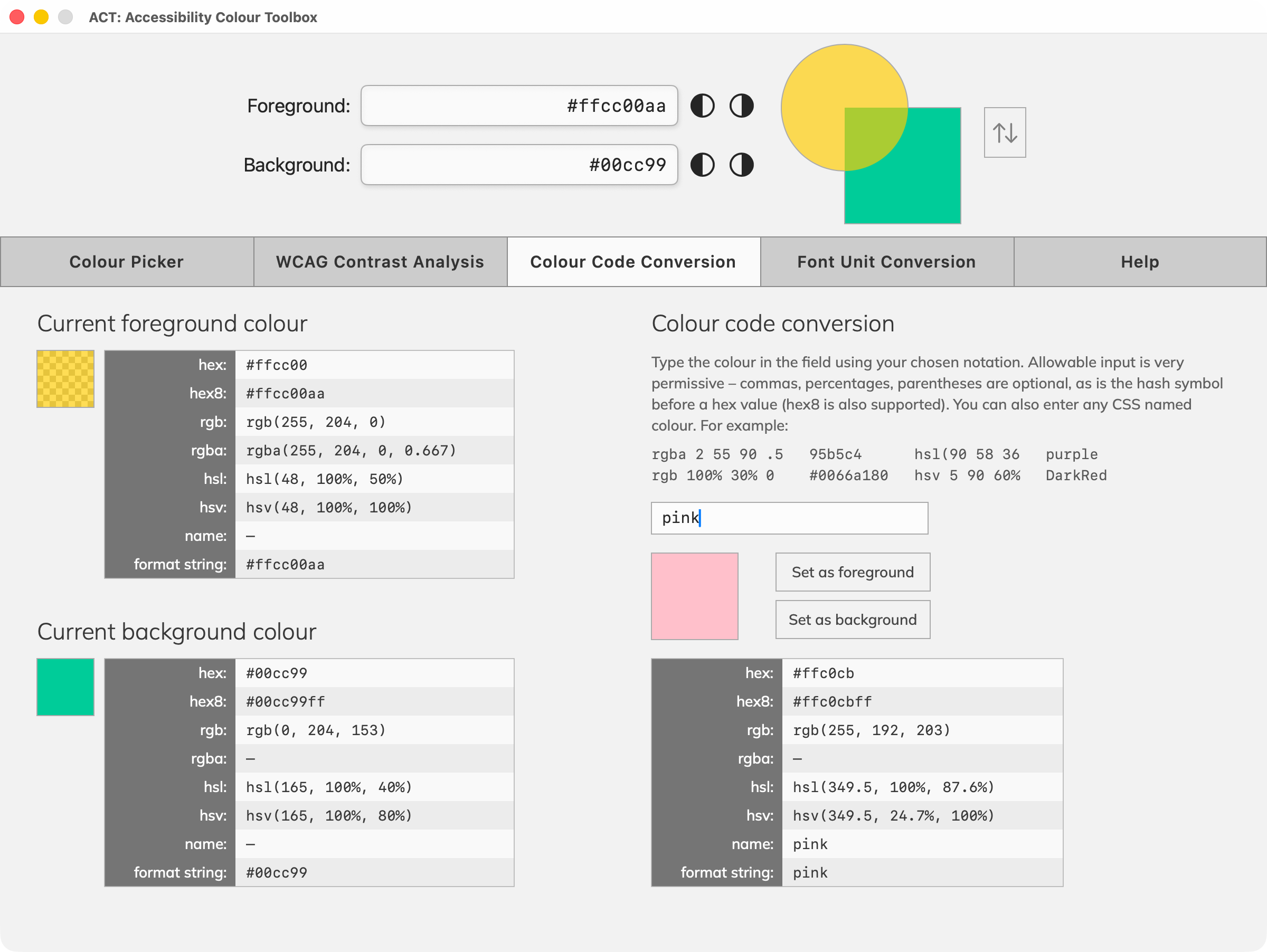
ACT is very forgiving about the way you enter colour values. It supports a wide range of colour notations, but also tolerates loosely-typed values that would otherwise fail in other apps. For example, you could enter:
rgba 2 55 90 .5
rgb 100% 30% 0
95b5c4
#0066a180
hsl(90 58 36
hsv 5 90 60%
purple
DarkRed
Colour selection
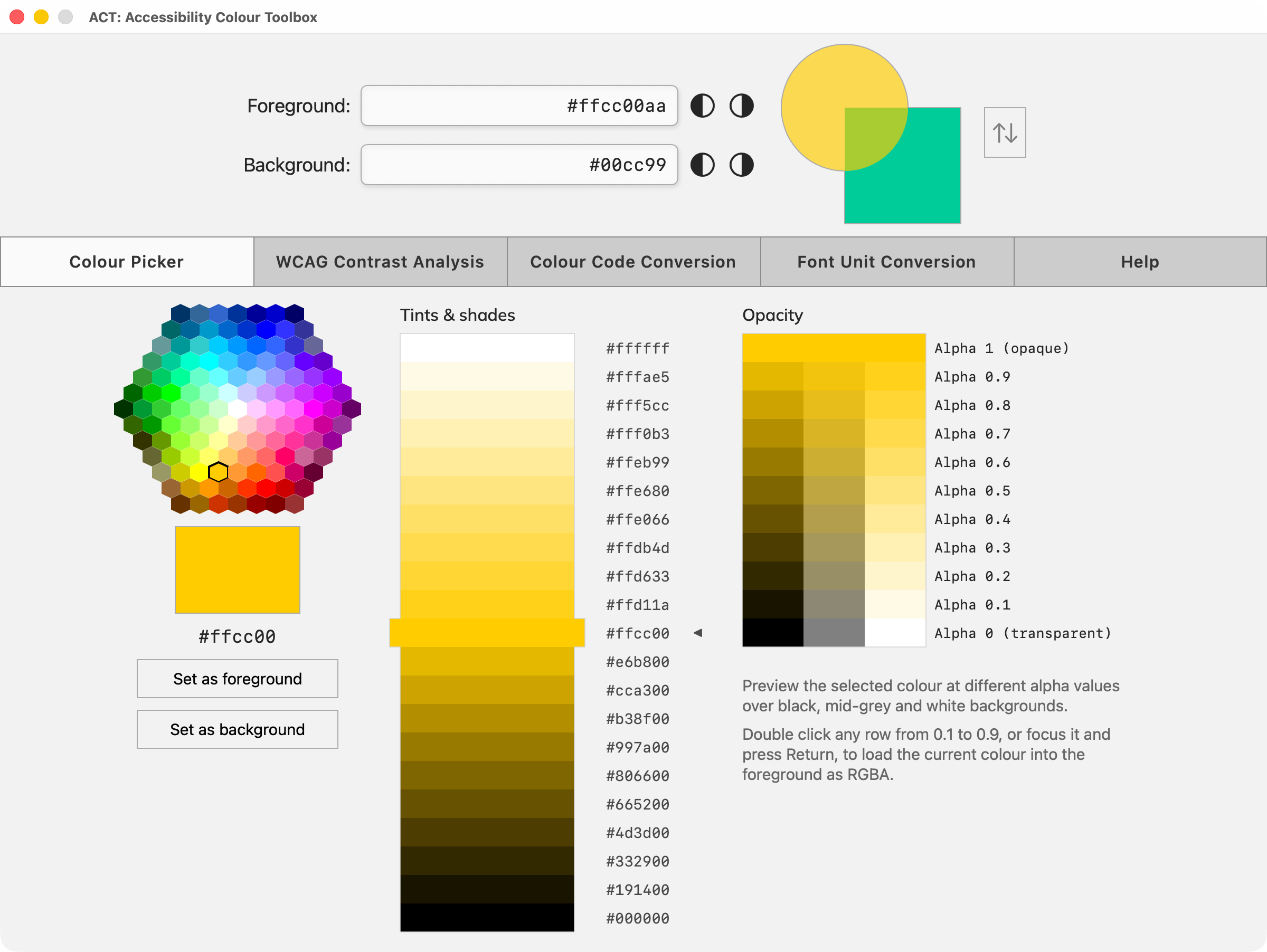
You can enter your chosen colours in the foreground/background fields directly – it will even work if you make a typing error. Or you can use the familiar polygon picker to make a quick selection and then pick tints (mixed with white) or shades (mixed with black). Once ready, apply the result to the foreground or background using a single click.
- Tints and shades of the current colour displayed in 5% steps.
- Opacities of the current colour for quick foreground selection.
- Foreground and background colours swapped with a single click.
- Supports hex, hex8, rgb, rgba, hsl, hsv and colour names.
Opacity handling
Opacity, or alpha, is a first-class part of the ACT workflow. Semi-transparent foreground colours often trip up designers because they yield effective colours, depending on the backgrounds in use. ACT's unique AI engine takes this into account when displaying colours and calculating values for WCAG contrast analysis.
- ACT supports opacity in RGBA or Hex8 notation.
- Opacity values for the current colour are shown in 10% steps.
- Opacity values are previewed over black, mid-grey and white.
- An opacity value can be quickly loaded as the foreground colour.
WCAG contrast analysis
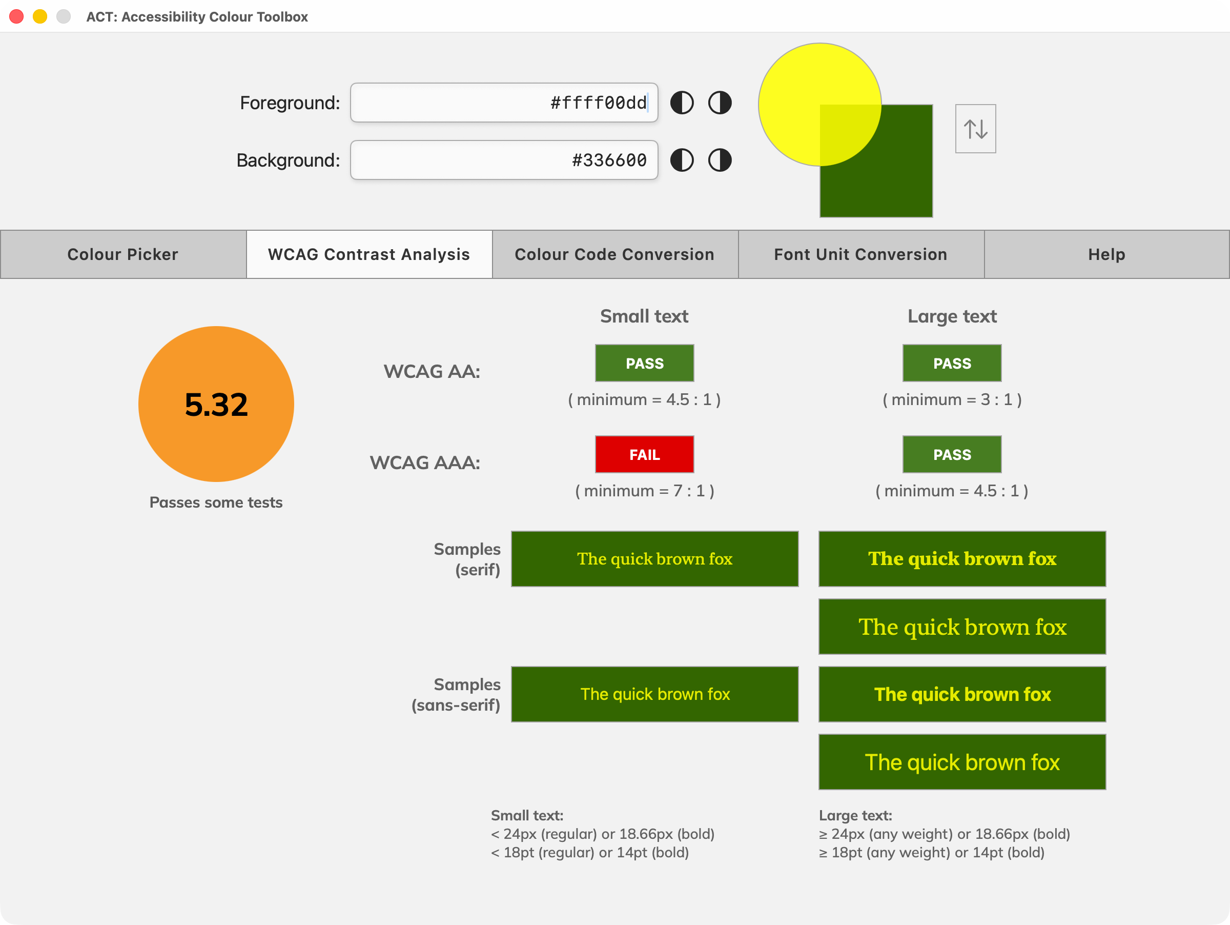
ACT measures the foreground-to-background contrast ratio and reports the outcome against WCAG criteria in real time. When a semi-transparent foreground is in use, ACT works with the effective composited colour so that the result reflects the real visual outcome. This is unique – it displays the virtual colour whenever opacity is used.
- Live contrast ratio assessment as colours change.
- Foreground transparency is accounted for during analysis.
- Pass or fail reporting for WCAG AA and AAA success criteria.
- Lightness and darkness fine tuning for precise results.
Colour code and font unit conversion
The conversion tools make ACT useful beyond contrast checking alone. Use the colour conversion tool to convert between notations and to test a separate candidate colours. And since font size has a bearing on accessibility, there is also a tool to convert between font units (px, em and percentage values) for scalable, accessible type sizing.
- Foreground and background values shown in multiple web notations.
- Independent test colour input with live sample swatch.
- Set a tested value as foreground or background with one click.
- Convert font sizes between px, em and % units.